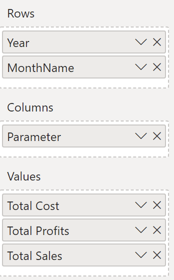
Field Parameters
At last, a user new feature in Power BI that has been worth writing about for months. For starters, Tableau already has this handy little tool anyway, so PBI users finally deserve a treat.
Field parameters is a relatively new feature that allows users to choose which columns are used as filtered values in Power BI visuals, i.e. to switch between dimensions and measures with the click of a button instead of the more complicated solutions that were previously required. It helps shorten the development time of Power BI reports and provides greater flexibility for both developers and report viewers.
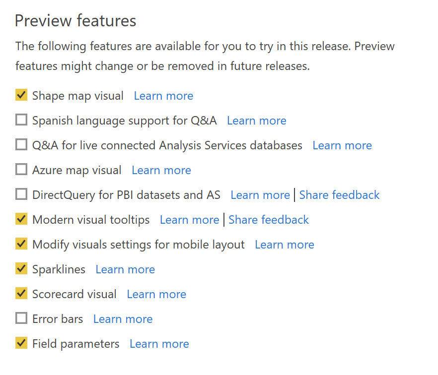
First seen in the May 2022 release of Power BI Desktop, Microsoft has rolled out Field Parameters as a preview feature.
For now, as I've written, the feature is in the preview parameters, so don't forget to enable it there.
As a demo, I'm going to bring up a field report, which in my case is one of our demo sales reports. From that, one of the first visuals, sales data is broken down by year. Here it is:
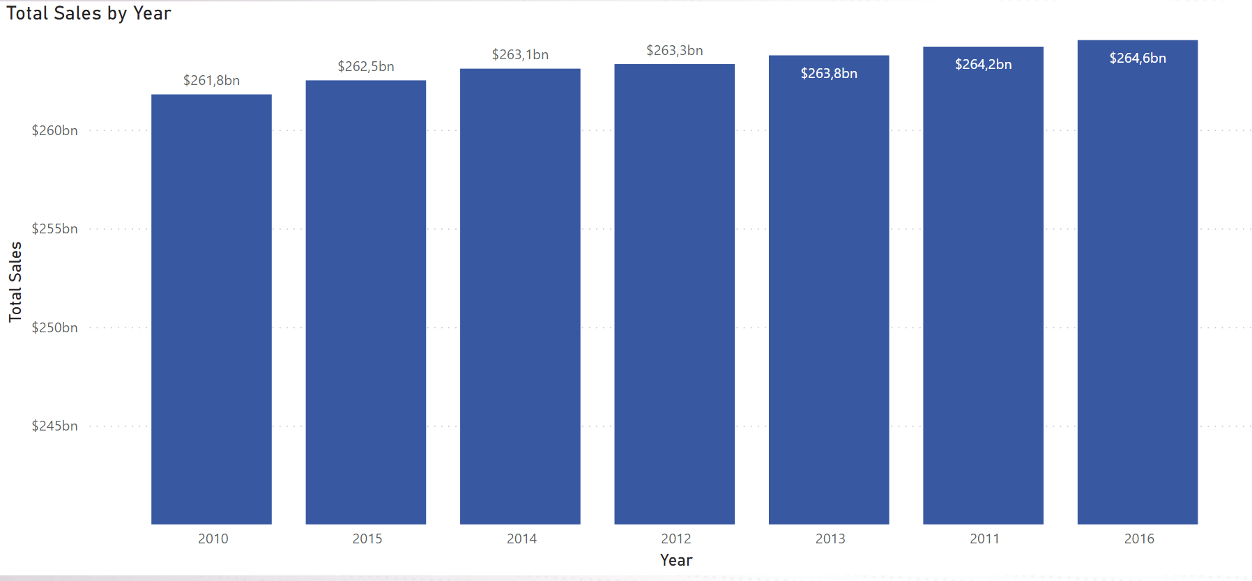
Ok, this is nice, but we want to go a little deeper. We also want to look at this data by product category, by sales channel or by region. We have the fields for these and I want to use them as legend. Of course we could create 3 separate visuals for this, but there are situations where there is either no space for all three or there is simply a more elegant solution. Let's find the Field Parameters function in Power BI Destktop.
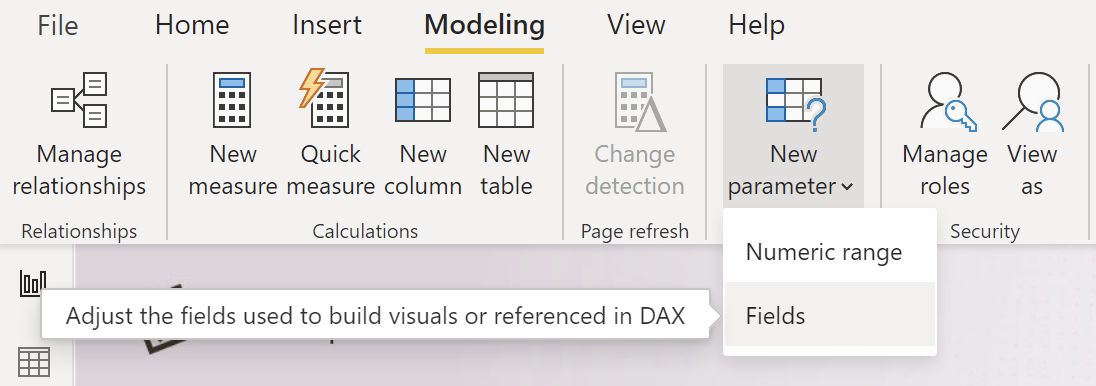
The new parameter function in the Modeling tab was already there in the PBI palette, as we could create custom scale-based slider sliders before this, but for us the second new option is the point. Let's pick it.
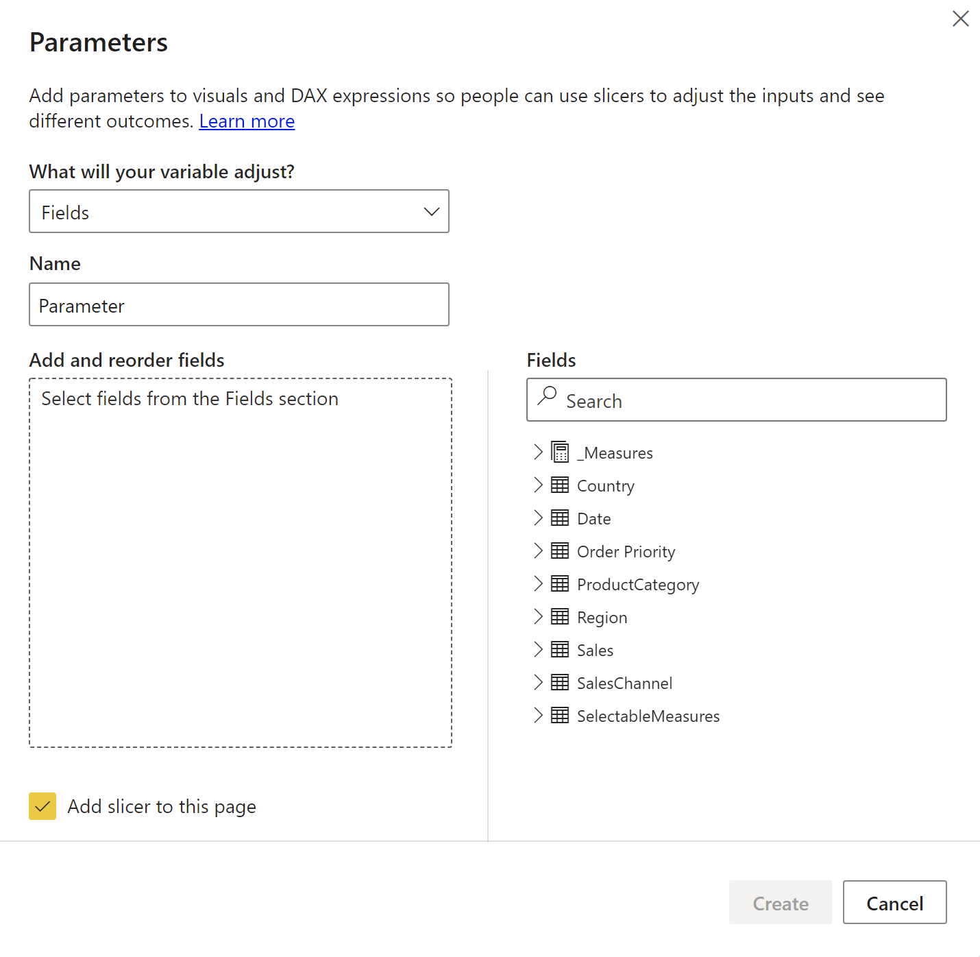
In the Parameters tab, we need to select the measures, dimensions on the right side that we want to use on our visual as axis, legend or any field value. The selected elements will be displayed on the left. You can also name our parameter in the upper left corner, which is important because the system will create a new field with this name. For the sake of simplicity, I'll let this name Parameter for now.
The point is that with this field we can create a slicer, which allows us to choose which value the visual should work with. Power BI will already create the filter for us, so the Add slicer to this page checkbox at the bottom is active by default. Of course, we can create it afterwards if we want.
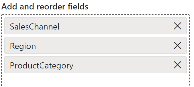
I have chosen these three fields, as I want to test these as a function of the value. If we click on the Create button, we can see that we have created a new field called Parameter on the right:
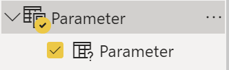
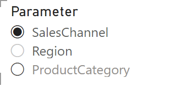
Our newly created slicer is also created, with the 3 elements selected. I have set it to Single select, as I only want to examine one at a time, there is no point in adding these values together.
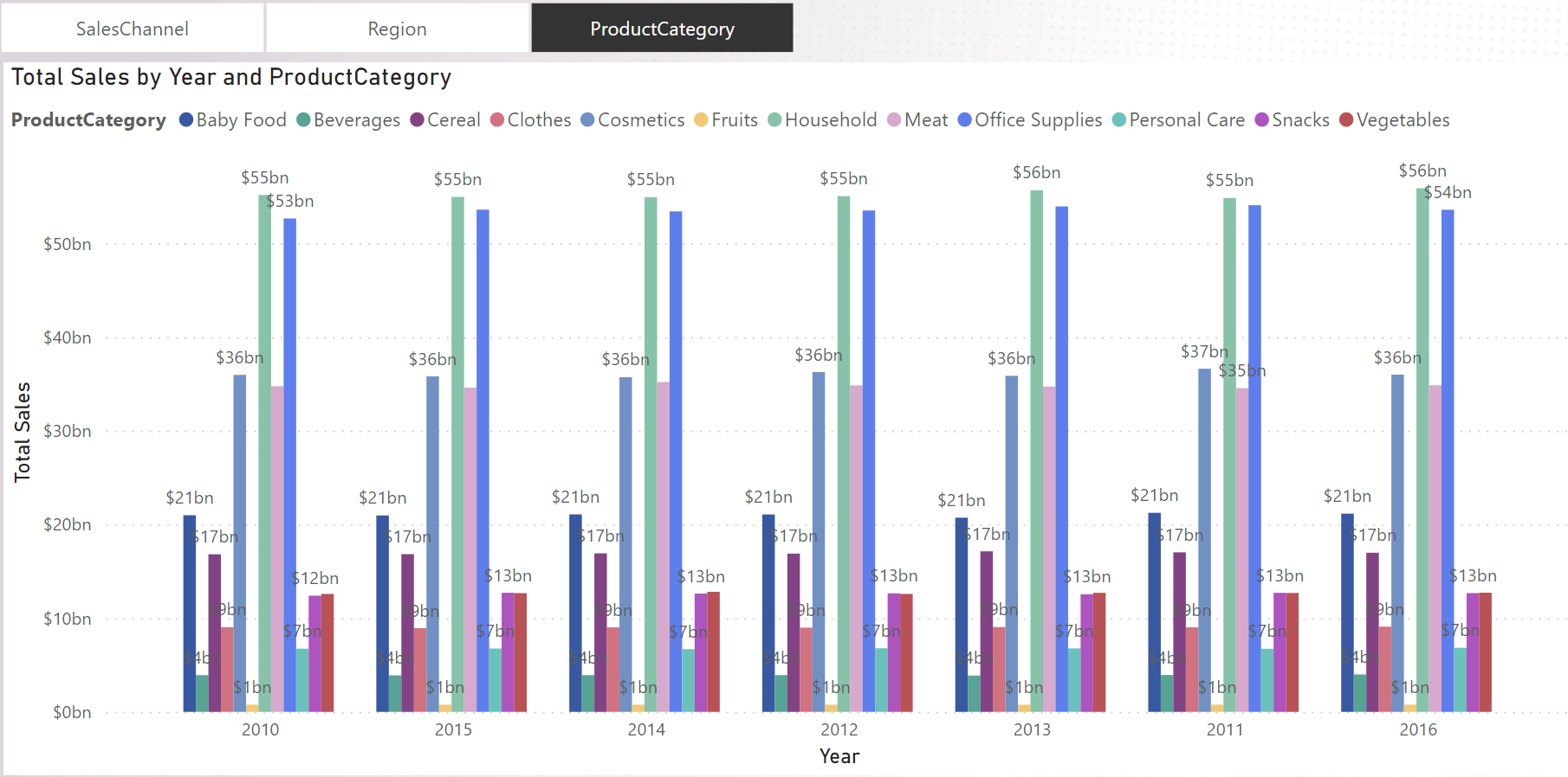
Finally, I want to apply the new parameter to our sales bar chart, all I have to do is to drag Parameter into the Legend field and we're done. I've also made the slicer a bit more "button-like" to make it more convenient to toggle. Here is the final result:
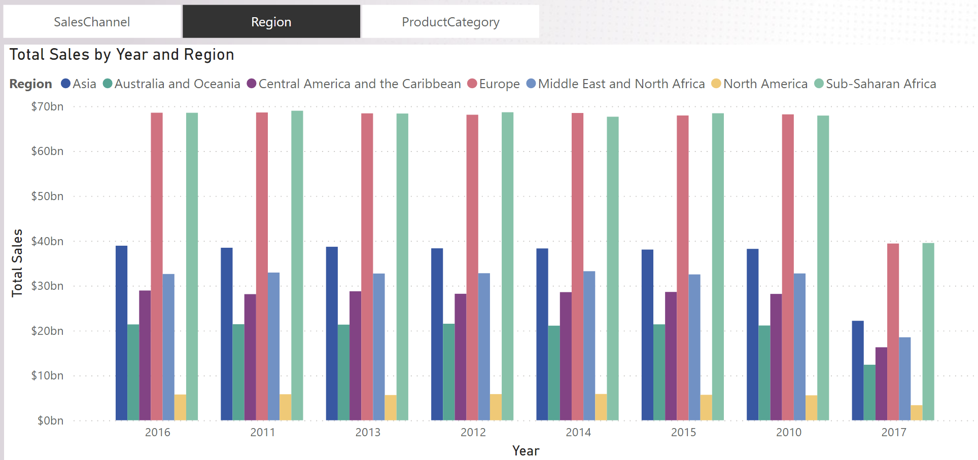
If I use the slicer above to switch to Product category, it switches to grouping by visual product category. Of course, you could do this before, but it's much, much more complicated.
We can imagine how much potential this has, can't we? We can apply our parameter to any field in any visual, giving our reports unprecedented flexibility.
The other very useful feature is to apply it to tables and matrixes. The logic is exactly the same. If we have a visual with many columns, we can drag and drop the columns into a parameter and from there we can use our slicer to snap in and out of fields as we like. If we even have a hierarchy in the slicer, we can hide and display entire groups with the click of a button. You know when a customer wants a simpler and a more detailed view in a table with many columns? This can be a very useful solution for that too.
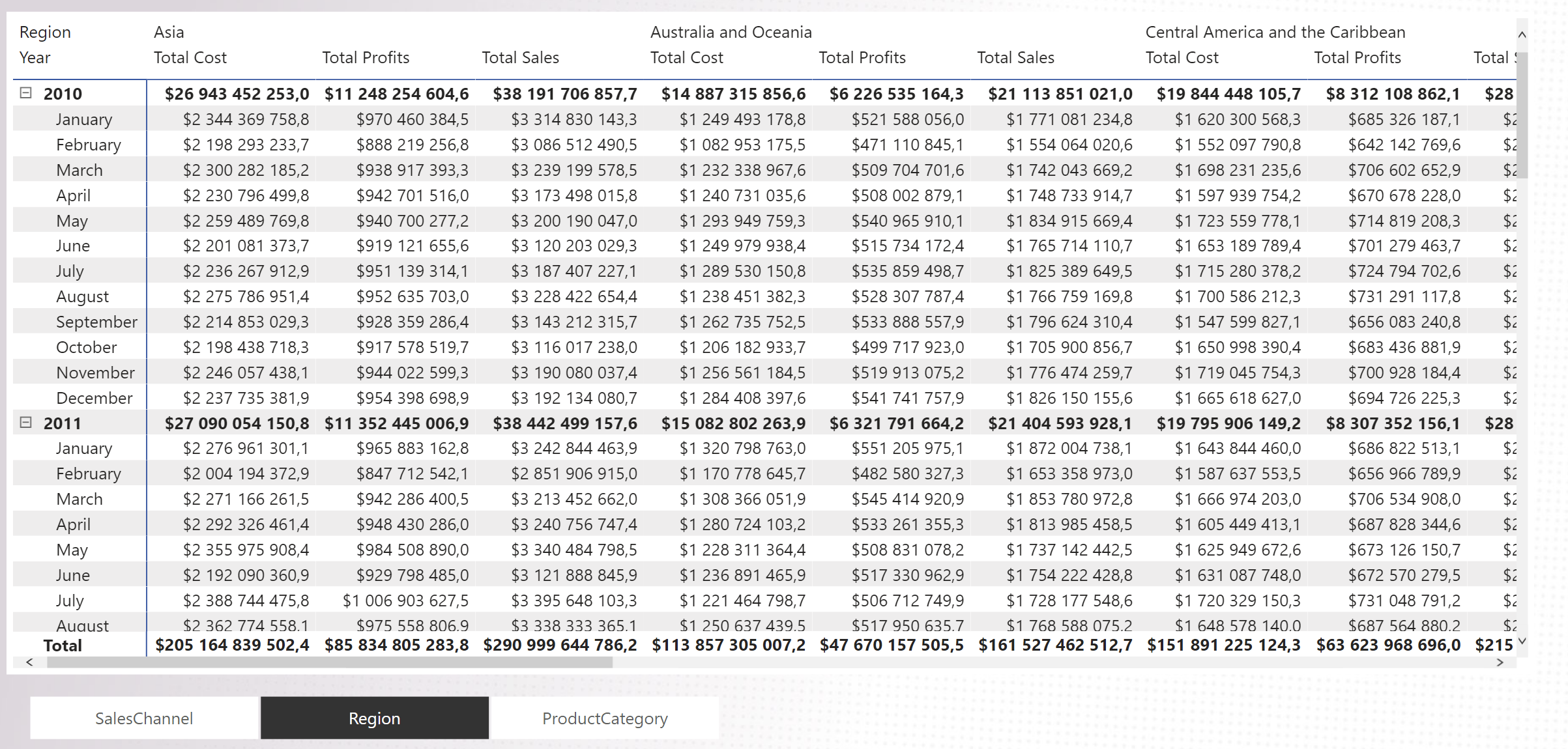
Going back to our example, I could use the same Parameter that I have already set for a matrix as follows (I didn't have to do anything other than apply the Parameter field to the Columns column.)
Using the buttons (slicer) below the matrix, I can change the look of the table based on what the column measures are displayed. (Here, Total cost, Toval Profits, Total Sales), Region, or Sales Channel breakdown.
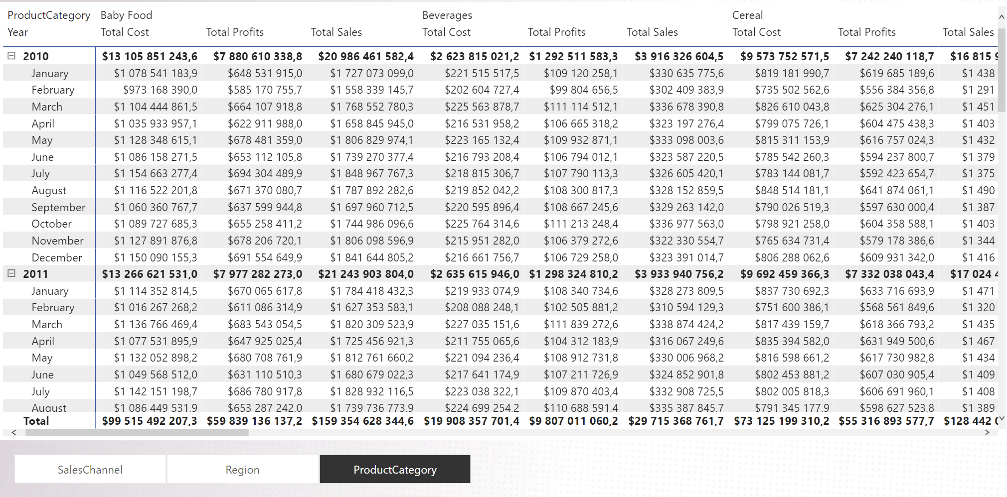
Same by Product Category:
Wow! Field Parameters is an extremely useful feature, allowing users to seamlessly change the columns, rows or other elements used in visuals.
Feature enhancements like this are good signs that Microsoft is working to make the Power BI user experience better for everyone. Keep it up...